Introduction
Store layout and visual merchandising play a critical role in shaping how customers experience a retail space. The way a store is organized influences how shoppers move, what products they notice, and ultimately what they decide to buy. Even small adjustments in aisle structure, product placement, or display design can significantly affect customer engagement and sales performance.
In physical retail environments, customer attention is limited. A well-planned store layout guides shoppers naturally through the space, while effective visual merchandising highlights the products that matter most. Together, they create a structured shopping journey that feels intuitive, comfortable, and engaging.
Retailers that treat layout and merchandising as strategic tools—not just design elements—gain a powerful advantage. They improve product visibility, reduce shopper confusion, and encourage customers to explore more sections of the store.
Understanding how store layout and visual merchandising work together helps retailers create spaces that are not only attractive but also optimized for customer flow and revenue generation.
What Is Store Layout in Retail?
A store layout refers to the physical arrangement of aisles, shelves, fixtures, displays, and pathways inside a retail space. It determines how customers move through the store, how easily they find products, and how much exposure they have to different product categories.
The main goal of a store layout is to create a clear and comfortable shopping journey. When customers can navigate a store without confusion, they tend to spend more time exploring products and are more likely to make purchases.
A well-designed store layout helps retailers:
- Guide customers through important product zones
- Increase exposure to featured or high-margin items
- Reduce congestion and confusion inside the store
- Encourage shoppers to explore multiple sections
- Improve the overall shopping experience
Retailers carefully design layouts to balance convenience and discovery. While customers should easily locate the products they need, the layout should also expose them to additional items they might not have planned to buy.
For example, supermarkets often place essential products like milk or bread toward the back of the store. This encourages shoppers to walk through other aisles, increasing the chances of impulse purchases along the way.
In simple terms, a store layout acts as the structural foundation of the retail experience, guiding how customers move and interact with products throughout the space.
Types of Store Layouts
Retailers use different store layouts depending on the store size, product categories, and customer shopping behavior. Each layout is designed to guide customer movement in a specific way while maximizing product visibility.
Below are the most common types of store layouts used in retail.
- Grid Layout
The grid layout is one of the most widely used formats, especially in supermarkets, pharmacies, and convenience stores. In this layout, shelves and aisles are arranged in straight lines, creating a structured and predictable pathway for shoppers.
Key characteristics of a grid layout:
- Parallel aisles with consistent spacing
- Clear product categorization
- Efficient use of retail space
- Easy navigation for customers
This layout works well for stores with a large number of products because it allows retailers to display many items while keeping the store organized.
- Loop (Racetrack) Layout
The loop layout, also known as the racetrack layout, guides customers along a predefined path that circles the store. Shoppers naturally move through the entire space before returning to the entrance or checkout area.
Key characteristics of a loop layout:
- A main pathway that loops around the store
- Product displays placed along the route
- High visibility for featured products
Retailers often use this layout in department stores and fashion outlets because it encourages customers to explore more sections of the store.
- Free-Flow Layout
The free-flow layout provides a more open and flexible store design. Instead of rigid aisles, fixtures and displays are arranged creatively to encourage exploration.
Key characteristics of a free-flow layout:
- Open pathways with fewer restrictions
- Creative product displays
- Focus on visual appeal and experience
This layout is commonly used in boutiques, apparel stores, and specialty retail stores, where the shopping experience is just as important as product availability.
- Spine Layout
The spine layout combines structured aisles with a central pathway that runs through the store. This main pathway acts as the spine, with product sections branching off on both sides.
Key characteristics of a spine layout:
- A clear central walkway
- Product sections extending from the main path
- Easy navigation for customers
This layout works well for medium-sized retail stores that want to maintain structure while still allowing some visual creativity.
- Hybrid Layout
Many modern retailers use a hybrid layout, which combines elements from multiple layout styles. For example, a store might use a grid layout for everyday products and a free-flow layout for featured or promotional areas.
Hybrid layouts allow retailers to balance efficiency and visual engagement, making them suitable for stores with diverse product categories.
Understanding different store layouts helps retailers design spaces that guide customer movement effectively while maximizing product exposure.
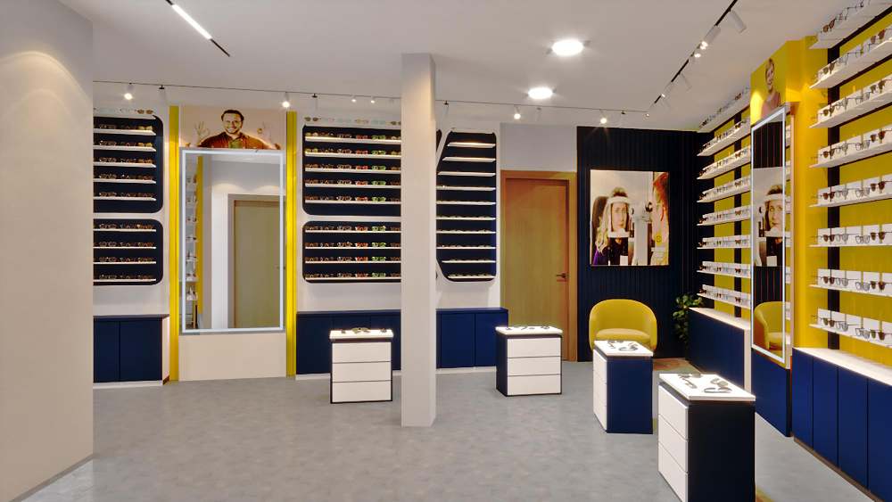
What Is Visual Merchandising?
Visual merchandising is the strategic presentation of products inside a retail store to attract attention, improve product visibility, and encourage customers to make purchases. It involves using displays, lighting, colors, signage, and product placement to create an engaging shopping environment.
While store layout focuses on the structure of the store and how customers move through it, visual merchandising focuses on how products are presented and highlighted along that journey.
Common elements of visual merchandising include:
- Window displays that attract customers from outside
- Product arrangement on shelves and tables
- Lighting used to highlight key items
- Color themes that reinforce brand identity
- Signage that communicates promotions or product details
- Seasonal or promotional displays that capture attention
The main purpose of visual merchandising is to make products easier to notice, easier to explore, and more appealing to buy.
For example, placing new arrivals at eye level, using focused lighting to highlight premium products, or grouping complementary items together can significantly influence how customers interact with products.
In simple terms, visual merchandising transforms a retail space from a place that stores products into a space that presents and sells them effectively.
Key Elements of Visual Merchandising
Effective visual merchandising is built on several design and presentation elements that work together to capture attention and guide customer decisions. When these elements are used strategically, they improve product visibility and create a more engaging shopping experience.
- Store Layout and Product Placement
The placement of products within the store strongly influences how customers interact with them. High-demand or high-margin items are often positioned at eye level or in high-traffic areas so they are easier to notice.
Grouping related products together also helps customers discover complementary items, increasing the chances of additional purchases.
- Lighting
Lighting is one of the most powerful visual tools in retail. Proper lighting highlights products, improves perceived quality, and creates the right atmosphere inside the store.
Retailers often use a combination of ambient lighting for general visibility and focused lighting to draw attention to specific displays or promotional areas.
- Color and Visual Theme
Color plays an important role in shaping the store’s mood and reinforcing brand identity. Consistent color themes across displays help create visual harmony and make certain products stand out.
For example, warm colors can create energy and urgency, while neutral tones can communicate elegance or simplicity.
- Window Displays
Window displays serve as the first point of visual communication between a store and potential customers. An attractive window display can capture attention, communicate seasonal themes, and encourage passersby to enter the store.
Strong window displays often focus on a single theme or product story rather than overcrowding the space.
- Signage and Messaging
Clear signage helps customers understand product categories, pricing, and promotions. Well-designed signs improve navigation and make it easier for shoppers to find what they need without confusion.
Signage can include category labels, promotional banners, product information cards, or directional indicators.
- Focal Points and Feature Displays
Focal points are specific areas designed to attract immediate attention. These displays often highlight new arrivals, seasonal collections, or promotional items.
By creating strong focal points throughout the store, retailers guide customer attention and encourage exploration.
When these visual merchandising elements work together, they create a store environment that is organized, attractive, and easy for customers to navigate.
How Store Layout and Visual Merchandising Work Together
Store layout and visual merchandising are closely connected. While they serve different purposes, they work best when designed as part of a single strategy.
A store layout controls customer movement, guiding shoppers through aisles, sections, and product zones. It determines the path customers follow and how they explore the store.
Visual merchandising, on the other hand, controls what customers notice along that path. Displays, lighting, product placement, and signage highlight specific products and encourage shoppers to stop, explore, and interact with them.
When both elements work together effectively, the store creates a smooth and engaging shopping journey.
For example, a retailer may design a loop layout that guides customers around the entire store. Along this route, visual merchandising techniques—such as feature displays, mannequins, or promotional signage—draw attention to important products.
This coordinated approach helps retailers:
- Guide customer movement naturally
- Highlight priority products in high-traffic areas
- Increase product visibility throughout the store
- Encourage customers to explore more sections
- Improve overall shopping experience
Without visual merchandising, a store layout may feel structured but uninspiring. Without a clear layout, visual displays may attract attention but fail to guide customer flow.
Together, store layout provides the structure, while visual merchandising provides the attraction, creating a retail environment that is both organized and engaging.
Benefits of Good Store Layout and Visual Merchandising
A well-designed store layout combined with effective visual merchandising can significantly improve how customers experience a retail environment. When products are easy to find and displays are visually appealing, shoppers are more likely to explore the store and make purchases.
Improves Shopper Flow
A clear store layout guides customers naturally from one section to another. When pathways are logical and easy to navigate, shoppers move comfortably through the store without confusion or congestion.
Smooth shopper flow increases the chances that customers will visit more sections and discover additional products.
Increases Product Visibility
Visual merchandising ensures that important products receive the attention they deserve. Strategic product placement, eye-level displays, and clear focal points make items easier to notice and evaluate.
When products are more visible, customers can make decisions faster and with greater confidence.
Encourages Longer Store Visits
An organized and visually engaging environment encourages customers to spend more time browsing. Stores that feel comfortable and interesting naturally invite exploration.
Longer dwell time often leads to higher purchase likelihood.
Boosts Sales and Impulse Purchases
Well-designed displays highlight promotions, new arrivals, or high-margin items. When customers encounter these products naturally during their shopping journey, impulse purchases become more likely.
Cross-merchandising—placing related products together—can also increase basket size.
Strengthens Brand Identity
Consistent visual presentation helps reinforce a store’s brand personality. Lighting, colors, display style, and layout all contribute to how customers perceive the brand.
A strong visual identity creates familiarity and builds trust across multiple store locations.
Enhances Overall Customer Experience
When store environments feel organized and visually appealing, customers enjoy their shopping experience more. Reduced confusion, better navigation, and attractive displays create a positive impression that encourages repeat visits.
8 Practical Store Layout and Visual Merchandising Tips
Improving store layout and visual merchandising does not always require a complete store redesign. Small, thoughtful adjustments can significantly improve shopper flow, product visibility, and overall engagement. Below are eight practical tips retailers can apply to enhance their store environment.
1. Create a Welcoming Entrance
The entrance is the first impression customers get of the store. Keep it open, clean, and free of clutter so shoppers feel comfortable entering. Place featured products or seasonal displays slightly inside the entrance to attract attention without overwhelming customers immediately.
2. Design a Clear Customer Pathway
Customers should naturally understand where to go next. A clear pathway guides them through important product zones and prevents confusion. Logical pathways encourage shoppers to explore more sections of the store.
3. Use Focal Points to Highlight Products
Each key area of the store should have a focal point that attracts attention. This could be a promotional display, a new collection, or a seasonal theme. A strong focal point prevents visual overload and directs customer attention effectively.
4. Improve Lighting Across Displays
Lighting enhances product appeal and helps important displays stand out. Use consistent lighting throughout the store and apply focused lighting on priority products or promotional areas.
5. Place Important Products at Eye Level
Products placed at eye level receive the most attention from customers. Retailers often use these positions for best-selling products, new arrivals, or high-margin items to increase visibility and sales.
6. Keep Displays Clean and Uncluttered
Overcrowded shelves make browsing difficult and reduce product appeal. Allow enough space between products so each item can stand out clearly and customers can evaluate options comfortably.
7. Use Clear Signage for Navigation
Simple signage helps customers find product categories quickly and understand promotions easily. Clear labels reduce confusion and improve the overall shopping experience.
8. Refresh Displays Regularly
Updating displays keeps the store environment fresh and engaging. Even small changes—such as rearranging featured products or introducing seasonal themes—can capture customer attention and encourage repeat visits.
Example of Store Layout and Visual Merchandising in Action
Consider a mid-sized apparel retailer that noticed customers were spending little time browsing and often missing new collections. Although the store had strong products, the layout and visual presentation were not effectively guiding customer attention.
The retailer made several changes to improve both store layout and visual merchandising.
First, the store redesigned its layout to create a clear pathway that guided shoppers through key product sections. Instead of scattered displays, the new layout encouraged customers to move naturally from the entrance through featured zones and toward the checkout area.
Next, the retailer improved visual merchandising by:
- Placing new arrivals at eye level near the entrance
- Using focused lighting to highlight seasonal collections
- Creating feature displays for promotional items
- Grouping complementary products together to encourage add-on purchases
These adjustments made the store easier to navigate and helped customers notice key products more quickly.
Within a few months, the retailer observed several improvements:
- Customers spent more time browsing the store
- Visibility of new collections increased
- Sales of featured products improved
- Overall store engagement became stronger
This example shows how store layout and visual merchandising work together to influence shopper behavior. When the structure of the store and the presentation of products are aligned, retailers can guide customer attention more effectively and improve sales performance.
Common Mistakes Retailers Make with Store Layout and Visual Merchandising
Even when retailers understand the value of store layout and visual merchandising, poor execution can limit their impact. Avoiding common mistakes helps ensure that store design and product presentation actually support customer experience and sales.
1. Overcrowded Displays
Placing too many products on shelves can create visual clutter. When everything competes for attention, customers may struggle to focus on individual items. Clean, spaced-out displays make products easier to notice and evaluate.
2. Poor Store Navigation
If customers cannot easily understand where to go next, they may feel confused or frustrated. A store layout should guide movement naturally with clear pathways and logical product sections.
3. Ignoring Product Hierarchy
Not all products should receive the same level of visibility. Best-selling or high-margin products should be placed in high-traffic areas or at eye level to maximize exposure.
4. Weak Lighting
Inconsistent or insufficient lighting can reduce the appeal of product displays. Proper lighting helps highlight key items and improves the overall atmosphere of the store.
5. Outdated or Static Displays
Displays that remain unchanged for long periods can make a store feel stale. Regular updates to displays keep the environment fresh and encourage repeat visits from customers.
6. Lack of Clear Signage
Without clear signage, customers may struggle to locate products or understand promotions. Simple category labels and promotional signs improve navigation and help shoppers make decisions faster.
7. Poor Maintenance of Displays
Even well-designed layouts can deteriorate if displays are not maintained. Misaligned products, empty shelves, or damaged signage can reduce the effectiveness of visual merchandising.
Frequently Asked Questions About Store Layout and Visual Merchandising
What is the difference between store layout and visual merchandising?
Store layout refers to the physical structure of the store, including aisles, pathways, fixtures, and how customers move through the space.
Visual merchandising focuses on how products are presented, including displays, lighting, colors, and signage used to attract attention and encourage purchases.
In simple terms, store layout guides customer movement, while visual merchandising guides customer attention.
Why is store layout important in retail?
Store layout is important because it determines how easily customers can navigate the store and discover products. A well-planned layout reduces confusion, improves shopper flow, and increases exposure to key product categories.
When customers can move comfortably through a store, they are more likely to explore additional sections and make purchases.
How does visual merchandising increase sales?
Visual merchandising increases sales by improving product visibility and making displays more appealing. Techniques such as eye-level product placement, clear focal points, and attractive displays help customers notice products quickly and make faster buying decisions.
It also encourages impulse purchases by highlighting promotional or complementary items.
What are the most common store layouts used in retail?
The most common retail store layouts include:
- Grid layout – commonly used in supermarkets and pharmacies
- Loop (racetrack) layout – guides customers along a defined path
- Free-flow layout – flexible layout often used in boutiques
- Spine layout – a central walkway with sections branching off
- Hybrid layout – a combination of multiple layout styles
Each layout is designed to influence how customers move through the store and interact with products.
How often should retailers update visual merchandising displays?
Retailers should refresh displays regularly to keep the store environment engaging. Seasonal updates, promotional changes, or new product launches are common opportunities to update displays.
Even small adjustments—such as rearranging featured products or changing signage—can help maintain customer interest.
Conclusion
Store layout and visual merchandising are two of the most influential factors in shaping the in-store shopping experience. While store layout determines how customers move through a space, visual merchandising determines what they notice and how they interact with products along the way.
When both elements are designed strategically, retailers can guide shoppers smoothly through the store while highlighting the products that matter most. This improves product visibility, reduces customer confusion, and creates a more engaging shopping environment.
A well-planned layout encourages exploration, while effective visual merchandising turns displays into attention points that influence purchasing decisions. Together, they help retailers convert foot traffic into meaningful sales opportunities.
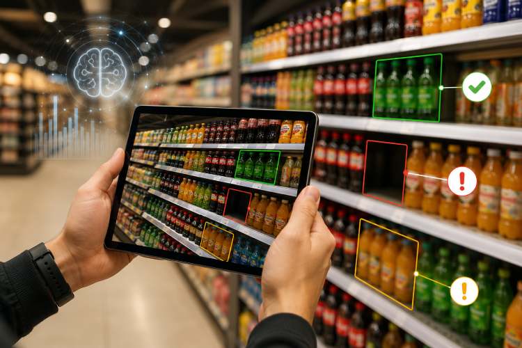
However, the real impact comes from consistent execution. Even the best store design loses effectiveness if displays become cluttered, products go out of stock, or planograms are not followed correctly.
Retailers that regularly monitor store conditions, refresh displays, and maintain strong merchandising standards create stores that feel organized, inviting, and performance-driven.
In competitive retail environments, store layout and visual merchandising are no longer just design considerations — they are strategic tools that help retailers improve customer experience and drive long-term sales growth.
Stay up to date with the latest video business news, strategies, and insights sent straight to your inbox!