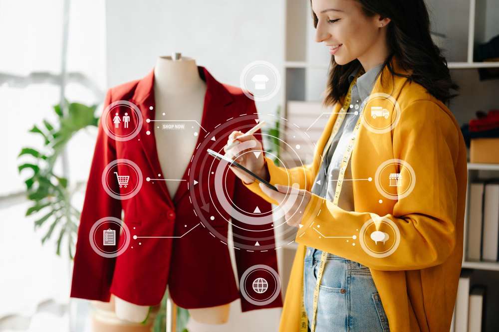
Visual merchandising examples are powerful because they show—not just tell—how retailers turn store displays into revenue-generating experiences.
From window displays that stop foot traffic to in-store layouts that guide shopper flow, visual merchandising directly influences how customers browse, engage, and purchase. In fact, studies consistently show that well-executed visual merchandising can significantly increase dwell time, impulse buying, and overall basket value.
But not all displays are created equal.
The difference between a store that “looks good” and one that converts consistently lies in strategic execution—how products are grouped, how lighting is used, how stories are told, and how consistently displays are implemented across locations.
In this guide, we’ll explore real-world visual merchandising examples across industries—including fashion, beauty, grocery, electronics, and luxury retail. For each example, you’ll learn:
- What the brand did
- Why it works
- What you can apply in your own stores
Because in modern retail, visual merchandising is not decoration—it’s strategy.
What Is Visual Merchandising?
Visual merchandising is the strategic presentation of products in a retail store to attract attention, communicate brand identity, and increase sales. It combines layout design, product placement, lighting, color psychology, and storytelling to influence how customers shop.
In simple terms, visual merchandising is the physical expression of your brand inside the store.
It includes:
- Window displays
- Store layouts and aisle flow
- Product grouping and cross-merchandising
- Shelf arrangements and planograms
- Lighting and color design
- Seasonal and promotional setups
The goal of visual merchandising is not just to make a store look attractive—but to guide shopper behavior. Well-designed displays:
- Draw customers into the store
- Highlight high-margin or priority products
- Encourage discovery
- Increase dwell time
- Drive impulse purchases
Visual Merchandising vs. Store Decoration
Store decoration focuses on aesthetics.
Visual merchandising focuses on sales performance.
Every display decision—placement, height, spacing, lighting—should be intentional and measurable.
When supported by planograms and execution tracking, visual merchandising becomes scalable across multiple locations—ensuring consistent brand experience from flagship stores to regional outlets.
Why Visual Merchandising Examples Matter
Understanding visual merchandising concepts is helpful—but studying real visual merchandising examples is what turns theory into execution.
Retailers often struggle not because they lack ideas, but because they lack clarity on what actually works in real stores. Examples provide practical insight into:
- How top brands structure displays
- How layout influences shopper movement
- How lighting and color shape buying decisions
- How product grouping increases basket size
Instead of abstract advice, examples show real-world application.
Examples Reveal What Drives Results
Strong visual merchandising examples demonstrate:
- What the brand implemented
- Why the strategy worked
- How it influenced customer behavior
- What measurable impact it created
For instance, a minimalist window display may boost perceived brand value, while a cross-merchandising setup in a grocery store may increase average order value.
When retailers analyze examples across industries, they gain repeatable patterns—not just inspiration.
Examples Help Standardize Execution Across Stores
For multi-location retailers, examples also act as reference models. They help HQ teams define:
- How displays should look
- How products should be arranged
- What visual standards must be maintained
This reduces execution variability and strengthens brand consistency.
In short, visual merchandising examples provide both inspiration and operational guidance—making them essential for retailers aiming to improve in-store performance.
Types of Visual Merchandising Examples (With Real-World Context)
Visual merchandising examples fall into several core categories. Each type serves a specific purpose—from attracting foot traffic to increasing basket size.
Below are the most effective types of visual merchandising used by leading retailers:
1. Window Display Examples
Window displays are designed to stop foot traffic and draw customers inside.
Example: Zara uses minimalist, color-coordinated window setups to highlight new collections with clean symmetry.
Example: Nike creates motion-driven displays featuring mannequins mid-action to convey energy and performance.
Why it works:
- Creates immediate visual impact
- Communicates brand tone instantly
- Sparks curiosity and urgency
2. Store Layout Examples
Store layouts guide how customers move and what they see first.
Example: IKEA uses a guided pathway layout that leads customers through fully staged rooms.
Example: Sephora uses an open-grid format to encourage exploration and product testing.
Why it works:
- Controls shopper flow
- Increases exposure to more products
- Encourages discovery and impulse buying
3. Product Grouping and Cross-Merchandising Examples
Grouping related products increases basket size and simplifies decisions.
Example: Grocery stores placing pasta next to sauces.
Example: H&M positioning accessories near apparel racks to inspire complete outfits.
Why it works:
- Encourages multi-item purchases
- Makes shopping intuitive
- Boosts average order value
4. Lighting and Color Psychology Examples
Lighting and color influence perception and emotion.
Example: Apple uses bright, clean lighting and open space to emphasize innovation and focus.
Example: Lush uses warm tones and earthy textures to signal natural freshness.
Why it works:
- Directs attention
- Shapes mood
- Reinforces brand identity
5. Seasonal and Thematic Display Examples
Seasonal displays create urgency and relevance.
Example: Macy’s holiday-themed window installations.
Example: Beauty retailers launching Valentine’s Day pink-themed collections.
Why it works:
- Creates timeliness
- Drives repeat visits
- Encourages limited-time purchases
6. Interactive and Digital Visual Merchandising Examples
Technology adds immersion and engagement.
Example: Adidas interactive LED walls that showcase product features.
Example: Ray-Ban AR mirrors for virtual try-ons.
Why it works:
- Enhances engagement
- Increases dwell time
- Bridges physical and digital retail
7. Minimalist Display Examples
Sometimes simplicity creates the strongest impact.
Example: Aesop uses clean shelving and uniform packaging to create calm visual harmony.
Why it works:
- Reduces visual clutter
- Elevates product focus
- Signals premium positioning
Visual Merchandising Examples by Industry
Visual merchandising examples vary by industry because shopper expectations, product types, and purchase behavior differ across sectors. Below are industry-specific examples that demonstrate how merchandising strategy adapts to context.
1. Fashion & Apparel Visual Merchandising Examples
Fashion retail relies heavily on aspiration and storytelling.
Example: Zara rotates coordinated outfits weekly, using neutral lighting and symmetrical racks to emphasize texture and fit.
Example: Louis Vuitton uses artistic window installations that blur the line between fashion and art.
Why it works:
- Encourages full-look purchases
- Reflects trend cycles
- Builds lifestyle aspiration
Key takeaway: Use mannequins, color coordination, and flow to create styled narratives—not just clothing displays.
2. Beauty & Cosmetics Visual Merchandising Examples
Beauty stores focus on color, lighting, and interaction.
Example: Sephora organizes products by need (skincare, fragrance, makeup) with bright, flattering lighting.
Example: Lush uses open displays and rustic textures to emphasize freshness and natural ingredients.
Why it works:
- Encourages sampling
- Makes navigation intuitive
- Enhances sensory engagement
Key takeaway: Make products accessible and interactive to increase trial and conversion.
3. Grocery & Supermarket Visual Merchandising Examples
Grocery merchandising balances functionality and inspiration.
Example: Whole Foods Market arranges produce in color gradients with handwritten signage.
Example: Trader Joe’s uses playful, localized chalkboard signs.
Why it works:
- Signals freshness and quality
- Simplifies decision-making
- Adds personality to routine shopping
Key takeaway: Visual merchandising in grocery should reduce friction while reinforcing freshness.
4. Electronics & Tech Store Examples
Tech retail emphasizes clarity and interaction.
Example: Apple uses minimalist tables and open spacing to spotlight devices.
Example: Samsung creates demo zones for product testing.
Why it works:
- Highlights innovation
- Encourages hands-on engagement
- Keeps focus on product features
Key takeaway: Remove clutter and let the product experience drive the display.
5. Home & Lifestyle Visual Merchandising Examples
Home décor retailers rely on contextual storytelling.
Example: IKEA builds fully staged room environments.
Example: Muji uses neutral tones and modular layouts to project calm simplicity.
Why it works:
- Helps customers visualize ownership
- Demonstrates product functionality
- Encourages multi-item purchases
Key takeaway: Create realistic environments that inspire imagination and practical application.
6. Luxury Retail Visual Merchandising Examples
Luxury merchandising focuses on exclusivity and precision.
Example: Chanel uses spotlighting and symmetrical layouts.
Example: Tiffany & Co. leverages its iconic blue branding and pristine glass displays.
Why it works:
- Communicates scarcity
- Elevates perceived value
- Reinforces brand heritage
Key takeaway: Use space, lighting, and minimal product density to signal premium positioning.
Key Principles Behind Successful Visual Merchandising
Behind every effective visual merchandising example is a set of proven principles. While creativity matters, successful retail displays are built on psychology, structure, and measurable execution.
Here are the core principles that drive high-performing visual merchandising:
1. First Impressions Drive Entry
Customers form an opinion about a store within seconds. Window displays and entrance zones determine whether someone walks in—or walks past.
Best practices:
- Highlight one clear theme or hero product
- Avoid clutter
- Refresh displays regularly
Why it matters: Strong first impressions increase footfall and store traffic.
2. Eye-Level Placement Increases Sales
“Eye-level is buy-level” remains one of the most powerful retail principles.
Best practices:
- Place high-margin or bestselling products at eye height
- Use lighting to reinforce focus zones
- Avoid overcrowding key shelves
Why it matters: Eye-level placement captures attention and drives impulse purchases.
3. Storytelling Enhances Emotional Connection
Great displays tell a story rather than simply showing products.
Best practices:
- Group products by lifestyle or occasion
- Use props to create context
- Maintain thematic consistency
Why it matters: Storytelling increases dwell time and emotional engagement.
4. Balance Aesthetics With Functionality
A visually stunning display that confuses shoppers reduces conversions.
Best practices:
- Keep pricing clearly visible
- Ensure navigation is intuitive
- Maintain accessibility
Why it matters: Visual clarity improves customer confidence and speeds up decisions.
5. Consistency Builds Brand Trust
Brand identity should feel uniform across all locations.
Best practices:
- Maintain consistent lighting tone and signage style
- Standardize planograms
- Use execution tracking tools to ensure compliance
Why it matters: Consistency strengthens brand recall and credibility.
6. Refresh Displays Regularly
Retail trends and seasons change quickly.
Best practices:
- Rotate themes every few weeks
- Align visuals with local events or holidays
- Use sales data to decide refresh timing
Why it matters: Fresh displays encourage repeat visits and reduce display fatigue.
7. Combine Creativity With Data
Modern visual merchandising blends art with analytics.
Best practices:
- Use heatmaps to analyze foot traffic
- Track sales per display zone
- Validate execution with photo audits
Why it matters: Data-backed merchandising ensures displays are not just attractive—but profitable.
How Technology Is Transforming Visual Merchandising
Visual merchandising is no longer driven by creativity alone. Modern retailers combine design with technology to optimize planning, execution, and performance measurement.
Here’s how technology is reshaping visual merchandising in retail:
1. AI-Powered Planograms
Artificial intelligence helps retailers design data-backed shelf layouts instead of relying on intuition.
AI-driven planogram tools analyze:
- Sales velocity
- Inventory turnover
- Shopper behavior
- Store layout constraints
This ensures products receive optimal shelf space based on performance—not guesswork.
Impact:
Higher sell-through rates and reduced overstock or underexposure.
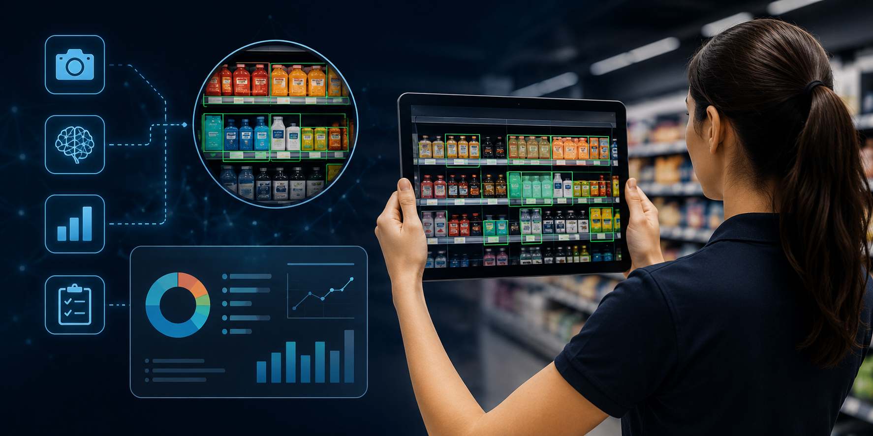
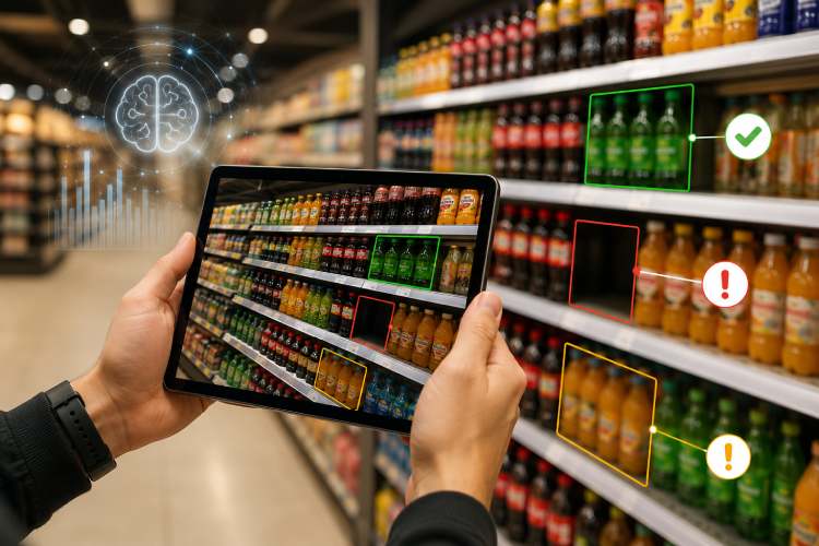
2. Image Recognition for Display Compliance
Execution consistency is one of the biggest challenges in visual merchandising.
Image recognition technology allows store teams to upload shelf photos, which are automatically compared against approved planograms. The system flags mismatches, missing products, or incorrect placements.
Impact:
- Faster audits
- Higher compliance accuracy
- Real-time execution monitoring
3. AR and Virtual Store Planning
Augmented and virtual reality tools allow retailers to design and test store layouts digitally before physical implementation.
Retail teams can:
- Simulate display placements
- Test lighting scenarios
- Optimize aisle flow
Impact:
Reduced rollout costs and better pre-launch optimization.
4. IoT and Smart Shelf Sensors
IoT-enabled shelves track stock levels and shopper interaction data in real time.
Sensors can:
- Detect low inventory
- Measure dwell time
- Monitor product engagement
Impact:
Improved replenishment accuracy and better merchandising decisions.
5. Analytics and Performance Dashboards
Modern visual merchandising is measurable.
Retailers use dashboards to track:
- Sales per display zone
- Conversion rates by layout
- Seasonal display performance
- Compliance trends across stores
Impact:
Displays evolve based on performance insights rather than aesthetic preference.
6. Centralized Execution Platforms
Technology also bridges the gap between design and execution. Platforms that connect HQ and store teams ensure that visual merchandising plans are implemented consistently across all locations.
These systems enable:
- Digital display instructions
- Mobile execution checklists
- Photo-based proof of implementation
- Real-time visibility across stores
Impact:
Improved brand consistency and faster rollout of new campaigns.
How Pazo Enhances Visual Merchandising Execution and Consistency
Designing impactful displays is only half the battle. The real challenge in visual merchandising is ensuring that every store executes those designs correctly and consistently. That’s where Pazo supports retail teams.
Pazo bridges the gap between head office merchandising strategy and store-level implementation—turning creative plans into measurable execution.
1. Digital Execution Checklists for Store Teams
Instead of relying on PDFs or email instructions, Pazo provides mobile-first digital checklists that guide store associates step by step through display setup.
Store teams can:
- View clear display instructions
- Access reference images
- Mark tasks complete
- Submit proof instantly
This removes ambiguity and standardizes execution across locations.
2. Photo-Based Proof of Display Implementation
Visual merchandising requires visual validation.
With Pazo, store teams upload photos of completed displays. These images are timestamped and centrally stored, allowing HQ teams to verify compliance without waiting for manual audits.
This creates accountability and ensures displays match brand standards.
3. Real-Time Visibility Across All Stores
For multi-store retailers, visibility is critical. Pazo provides centralized dashboards that show:
- Which stores completed display rollouts
- Where compliance gaps exist
- Which regions require follow-up
This allows proactive correction before execution issues impact customer experience.
4. Escalation and Compliance Workflows
If a display is incomplete or incorrectly implemented, Pazo triggers alerts to the appropriate manager. Escalation workflows ensure no issue remains unresolved.
This transforms visual merchandising from a creative initiative into a controlled operational system.
5. Data-Backed Continuous Improvement
By combining execution data with performance insights, retailers can refine their merchandising strategies over time.
Pazo helps teams understand:
- Which display types are executed consistently
- Where compliance tends to drop
- How rollout speed impacts sales performance
This closes the loop between planning, execution, and optimization.
By integrating task management, proof-of-execution, and real-time visibility, Pazo ensures that visual merchandising strategies are not just designed well—but delivered flawlessly across every location.
Conclusion: Turning Visual Merchandising Into Measurable Impact
The best visual merchandising examples share one thing in common—they combine creativity with strategy. From window displays and store layouts to product grouping and seasonal storytelling, every successful retail display is designed with intention.
But inspiration alone isn’t enough.
For visual merchandising to truly drive sales, it must be executed consistently, refreshed regularly, and measured against performance data. Retailers that treat visual merchandising as a structured system—not just a creative exercise—see stronger brand consistency, higher customer engagement, and improved in-store conversions.
As technology continues to shape retail, the future of visual merchandising will be increasingly data-driven, scalable, and execution-focused. Planograms, analytics, and centralized execution platforms now ensure that every store delivers the same high-impact experience—without compromising creativity.
In modern retail, visual merchandising isn’t decoration.
It’s a revenue lever.
And when backed by structured execution and real-time visibility, it becomes one of the most powerful tools a retailer can use to influence shopper behavior and drive growth.
Stay up to date with the latest video business news, strategies, and insights sent straight to your inbox!