Retail
Visual Merchandising Displays: Creative Ideas That Drive Sales

CEO - Pazo
In retail, it’s not just what you sell — it’s how you show it. The best stores don’t just stack products; they stage experiences that stop shoppers in their tracks. From stunning window displays that make people pause outside, to perfectly arranged shelves that guide them effortlessly through the store — visual merchandising displays are the silent salespeople of retail.
A powerful display tells a story before a salesperson says a word. It influences how long shoppers linger, what they pick up first, and ultimately, what they buy. Yet, too often, brands focus on what to display and forget how to display it. That’s where visual merchandising mastery comes in — combining design, psychology, and execution to turn space into strategy.
Poor display execution can break the chain between brand intent and shopper experience, leading to lost engagement, missed impulse buys, and inconsistent store presentation. But when done right, the results are immediate — higher foot traffic, stronger brand recall, and a measurable lift in sales.
This guide breaks down the different types of visual merchandising displays, explores practical window display ideas, and shows how the right tools (and execution discipline) can transform your retail floor into a living, breathing extension of your brand.
Visual merchandising displays are the bridge between your products and your customers’ emotions. They’re not just fixtures or shelves — they’re strategic storytelling tools designed to attract attention, spark curiosity, and influence buying behavior. Every element, from lighting and layout to color and texture, works together to create a seamless shopper experience that guides people from “just browsing” to “I need this.”
Think of them as the visual language of retail. A well-designed display tells your brand’s story without words — it highlights product value, communicates lifestyle aspirations, and connects emotionally with your audience. Whether it’s a seasonal window display that turns heads from the street or a freestanding in-store setup that spotlights a new launch, great displays help customers feel before they buy.
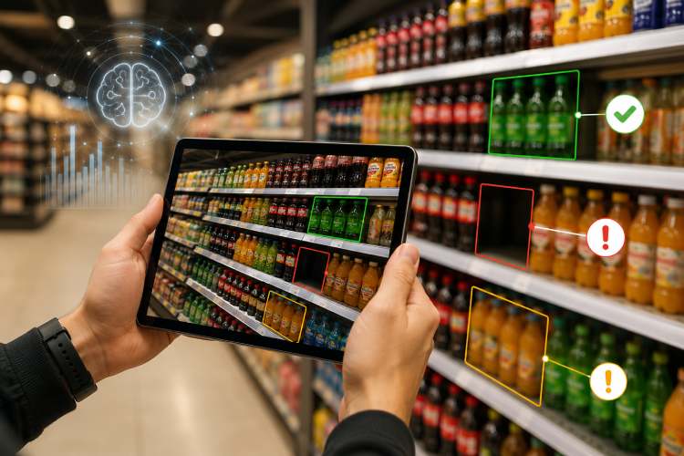
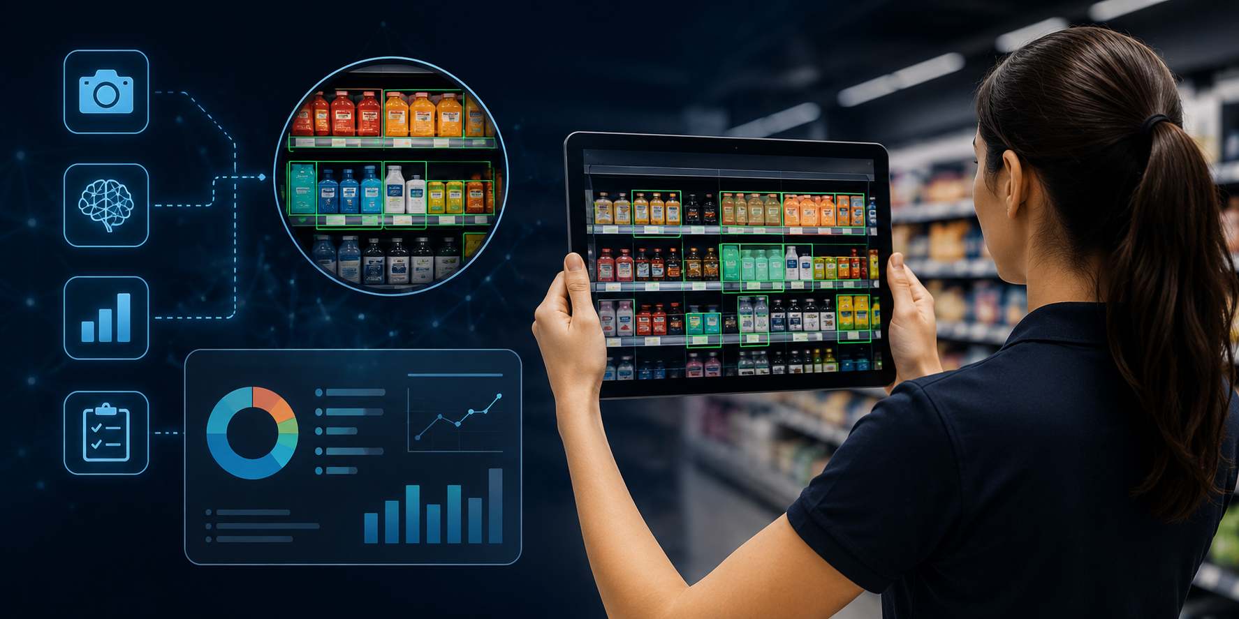
What makes them so powerful is their versatility. Displays can serve different purposes — driving impulse buys at the checkout counter, promoting new collections, cross-merchandising complementary items, or simply reinforcing brand identity across multiple locations. When backed by a data-driven planogram and consistent execution, they transform from decoration into a measurable growth lever for your store.
In modern retail, displays are silent storytellers — shaping shopper behavior, driving impulse buys, and creating brand experiences. Whether it’s a boutique, grocery chain, or electronics store, your choice of display directly impacts how customers perceive value, navigate space, and make purchase decisions.
Let’s explore the six most powerful types of visual merchandising displays, their psychology, and how to use them effectively.
Your window display is your billboard to the world. It’s where your brand gets just 3 seconds to grab attention from people walking by.
Purpose:
Psychology:
Humans are visual creatures. Bright colors, symmetry, and motion naturally trigger curiosity and approach behavior.
Best Practices:
Pro Tip:
Refresh your window display every 3–4 weeks to maintain novelty and match seasonal moods.
Example:
A home décor brand creates a “Cozy Winter” window with faux snow, candles, and knitted throws. Passersby don’t just see products — they feel warmth and comfort, compelling them to step inside.
POP displays are your store’s final call-to-action — strategically placed near checkouts or high-traffic areas to capture last-minute decisions.
Purpose:
Psychology:
When customers are at checkout, they’re in a “buying mindset.” This is the perfect time to nudge small, easy decisions.
Best Practices:
Example:
A supermarket places a POP tray near billing counters with protein bars, gum, and travel-size sanitizers. Even shoppers who came in for groceries often pick one more item — driving micro-conversions.
Mannequins are the human form of aspiration. They help shoppers visualize themselves wearing your products, making the buying decision more emotional than logical.
Purpose:
Psychology:
Seeing an outfit on a mannequin activates mirror neurons — the shopper imagines themselves in the look, creating desire and intent.
Best Practices:
Example:
Zara showcases three mannequins styled under one cohesive theme — one casual, one chic, one formal. Shoppers are subtly guided to build full outfits instead of single-item purchases.
Table displays invite exploration — they encourage shoppers to touch, feel, and mix products in a relaxed, open setting.
Purpose:
Psychology:
Touch increases purchase intent. The more shoppers handle products, the higher the perceived value.
Best Practices:
Example:
A lifestyle brand creates a “Work From Home Essentials” table featuring scented candles, notebooks, and ergonomic accessories — all within arm’s reach. It feels like a curated lifestyle, not a random shelf.
Endcaps (the ends of aisles) and freestanding units command maximum visibility — they’re billboards inside your store.
Purpose:
Psychology:
Shoppers subconsciously slow down near open, well-lit focal points.
Best Practices:
Example:
A grocery chain sets up a “Healthy Mornings” endcap with granola, oats, and nut milk bundles. It drives cross-category sales while visually reinforcing the brand’s wellness positioning.
In today’s omnichannel retail, digital screens are becoming the new visual storytellers — blending data, motion, and personalization.
Purpose:
Psychology:
Moving visuals hold 400% more attention than static images. They increase dwell time and influence purchase confidence.
Best Practices:
Example:
A skincare store installs a touchscreen kiosk that scans skin type and recommends personalized routines. Customers interact longer, learn more, and feel confident buying.
The secret isn’t using all display types — it’s combining them strategically based on store layout and category roles:
When all these zones work together — supported by strong planograms and execution discipline — your store transforms into an immersive experience that sells 24/7.
Great visual merchandising isn’t accidental — it’s behavioral science wrapped in creativity. Every color, light, texture, and placement you choose influences how shoppers think, feel, and act. Understanding why people stop, touch, and buy helps you design displays that don’t just look good — they perform.
Let’s unpack the key psychological triggers behind successful visual merchandising displays 👇
Color is the first thing the human brain processes — even before words or logos. It defines mood, communicates value, and attracts the right audience.

Pro Tip: Stick to a three-color palette — one primary (brand), one accent (attention), one neutral (balance). Too many colors create visual noise and fatigue.
Lighting turns an average shelf into a stage. It highlights key SKUs, builds depth, and guides the eye exactly where you want it to go.
Psychology: Our brains naturally follow the brightest point in a scene. Lighting, therefore, silently tells shoppers, “look here.”
Example: A jewelry counter with soft spotlighting on each ring instantly increases perceived worth — even before the shopper checks the price.
The human eye seeks patterns — and breaks in those patterns grab attention.
Effective displays use contrast (in color, size, or height) to create rhythm and focus.
Pro Tip: Avoid visual overload. The best displays have “white space” that lets products breathe — giving each item its own spotlight.
The most profitable space in your store? Between waist and eye level.
That’s where shoppers naturally focus — it’s the “strike zone.”
Strategy:
Example: In a beauty store, keeping luxury serums at eye level and budget creams below subconsciously influences which one feels “better.”
Static displays are good. Moving displays are magnetic. Adding motion or interactive elements (like digital touchscreens, AR mirrors, or rotating pedestals) creates engagement loops that keep shoppers around longer — and longer dwell time = higher conversion.
Psychology:
Movement triggers our primitive “attention reflex.” The brain sees motion as potential importance — we must look.
Tactics:
Example: A cosmetics brand displays a looping “before & after” demo screen near mirrors — customers pause, watch, and try the product.
At its core, visual merchandising is storytelling. When done right, shoppers don’t just see your products — they feel something.
Tell stories that connect emotionally:
Example: IKEA doesn’t sell furniture — it sells “home.” Each room setup tells a relatable story, making you imagine your own life in it. That’s visual merchandising mastery.
Even the most stunning display fails if it looks different across stores.
Consistency reinforces brand memory and trust. Shoppers should recognize your display style instantly — whether in Mumbai, Madrid, or Manila.
Pro Tip:
Use planograms and digital checklists (like Pazo’s platform) to ensure consistent execution, layout adherence, and brand integrity across every location.
Effective displays combine aesthetic appeal, psychological insight, and operational consistency.
When you align these five forces, your displays stop being decorative — they start becoming profitable.
Designing a display isn’t just arranging products — it’s about engineering shopper behavior.
Every light, shelf, and sign should serve a purpose: to attract, engage, and convert.
Here’s a step-by-step framework to help you create visual merchandising displays that don’t just look beautiful — they sell beautifully.
Before you start sketching ideas or moving fixtures, ask:
👉 What is this display meant to achieve?
Every display falls into one of these goals:
Pro Tip: Don’t try to do all three at once. A confused display doesn’t sell — a focused one does.
People don’t connect to products — they connect to stories.
Your display should evoke a scenario that makes shoppers feel something.
Ask:
Example Themes:
Each theme tells a story that helps customers visualize themselves using your products — and that’s when buying becomes emotional, not logical.
Now decide which type of display suits your objective and space:

Pro Tip: Layer multiple display types throughout the store for a seamless shopper journey — attract → explore → purchase.
A great display guides the eye without overwhelming it. Follow the 3-Level Merchandising Principle:
Then apply the Pyramid Composition Rule:
Arrange products in a triangular layout — tallest items in the middle, smaller ones around. It naturally draws the eye upward and inward.
Bonus: Use floor markers or subtle lighting to direct shopper movement — a simple path can increase dwell time by up to 20%.
Visual merchandising isn’t just visual. The most engaging displays stimulate multiple senses.
Example:
Lush Cosmetics uses open bins, strong fragrances, and bright color blocks. Their stores feel alive — every display invites touch and emotion.
Human eyes naturally move in a Z-pattern — left to right, top to bottom.
Design your displays to follow this flow:
This flow subtly leads shoppers through your visual story without effort — increasing engagement time.
Even the best designs fail without consistent execution.
Ensure every store implements the same vision through:
Tools like Pazo make this process frictionless — turning your creative vision into measurable compliance data.
Visual merchandising doesn’t end once the display is set — it evolves.
Track key metrics to know what’s working:
Refine layouts every few weeks based on data — not intuition.
Pro Tip:
Displays are like campaigns — launch, learn, and iterate. The more you measure, the more profitable they become.
A well-designed visual merchandising display is a conversation between your brand and your shoppers. When done right, it doesn’t shout — it whispers the right message to the right person at the right time.
That’s the magic that turns a store visit into an experience — and a glance into a sale.
As someone who has built highly scalable products from the ground up, I've always been drawn to solving challenging problems. But it's the quest for operational excellence that truly lights my fire. The thrill of streamlining processes, optimizing efficiency, and bringing out the best in a business – that's what gets me out of bed in the morning. Whether I'm knee-deep in programming or strategizing solutions, my focus is on creating a ripple effect of excellence that transforms not just businesses, but the industry at large. Ready to join forces and raise the bar for operational excellence? Let's connect and make retail operations and Facilities Management better, together.
Stay up to date with the latest video business news, strategies, and insights sent straight to your inbox!