Retail
7 Key Elements of Visual Merchandising in Retail
Learn the 7 essential elements of visual merchandising in retail, including color, lighting, layout, and signage—plus real-world execution tips.

CEO - Pazo

Learn the 7 essential elements of visual merchandising in retail, including color, lighting, layout, and signage—plus real-world execution tips.
Visual merchandising plays a critical role in how customers perceive a retail store and make buying decisions. From the moment a shopper notices a window display to how they move through aisles and interact with shelves, visual merchandising influences attention, emotion, trust, and purchase behavior.
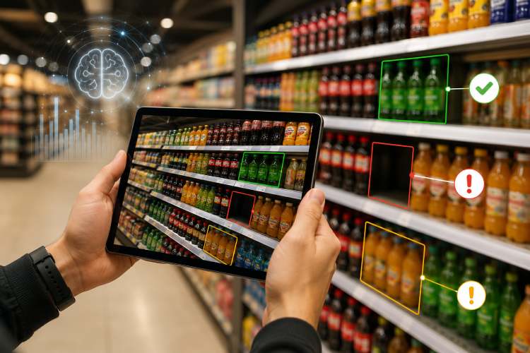
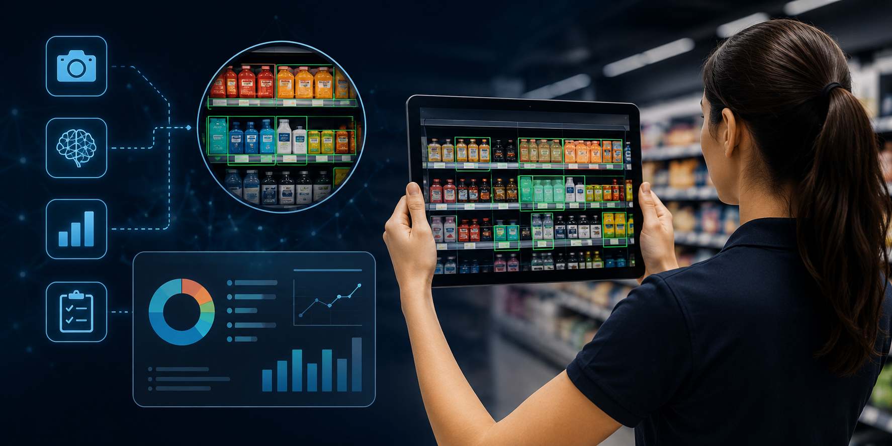
The elements of visual merchandising are the foundational components used to design effective retail displays and store layouts. These elements help retailers present products clearly, guide customer movement, reinforce brand identity, and improve overall store performance.
When visual merchandising is done well, customers don’t feel “sold to.” Instead, they feel guided, confident, and comfortable making decisions. When done poorly, even good products struggle to perform.
In this guide, we break down the core elements of visual merchandising, explain how each element works in real retail environments, and share practical, non-salesy examples and execution tips retailers actually use on store floors.
The elements of visual merchandising are the core components retailers use to design effective store layouts and product displays that guide customer behavior and increase sales.
The 7 key elements of visual merchandising are:
These elements work together to improve product visibility, shape customer movement, reinforce brand identity, and enhance the overall in-store experience.
In retail, visual merchandising is not decoration—it is structured store design. When these elements are aligned and executed consistently, they reduce friction in the customer journey and make purchasing decisions easier.
When misaligned, even strong products underperform.
In the sections below, we break down each element of visual merchandising in retail, explain how it works in real stores, and share practical execution insights.
Color is one of the most powerful elements of visual merchandising because it directly influences attention, emotion, and buying behavior inside a retail store.
In visual merchandising, color is used to:
Retailers rarely use color randomly. Strategic color application ensures customers notice what matters most.
Different retail formats use color differently:
Color guides attention. If everything is bold, nothing stands out.
A footwear retailer introduced a new sneaker line that initially received low engagement. The product remained the same, but the display background changed from white to matte black.
The increased contrast improved visibility immediately. Customers noticed the product faster, engagement increased, and trials improved without changing price or placement.
Color should guide focus—not overwhelm the shopper.
Among all visual merchandising elements, color is often the fastest way to redirect attention. When used intentionally, it improves discoverability and enhances store clarity.
Lighting is a critical element of visual merchandising because it shapes how products look and how customers feel inside a retail store.
In visual merchandising, lighting is used to:
Even well-designed displays can underperform if lighting is poor.
Retailers use layered lighting strategies that combine:
Examples from real retail environments:
Lighting affects perception—and perception influences purchase decisions.
A fashion retailer noticed strong footfall but low conversion. An internal review revealed that trial rooms were dim and created harsh shadows.
After installing warmer LED lights with balanced side illumination, customers spent more time trying products and felt more confident in purchases. Conversions improved without changing pricing or inventory.
For example, warmer tones often suit apparel and décor, while cooler tones enhance electronics displays.
Among the key elements of visual merchandising, lighting directly impacts perceived product quality. Poor lighting creates doubt—even when products are strong.
Well-executed lighting builds confidence and supports decision-making naturally.
Space is one of the most overlooked yet powerful elements of visual merchandising. It determines how products are arranged, how easily customers can browse, and whether displays feel clear or cluttered.
In retail, space includes:
When space is managed well, customers feel comfortable and confident. When poorly managed, stores feel overwhelming.
Different retail formats use space intentionally:
Space directly influences browsing speed, product visibility, and purchase confidence.
A cosmetics retailer reduced SKU overcrowding on a best-selling shelf. Instead of packing every variant tightly, they removed slower-moving items and increased spacing between products.
The result:
Customers spent less time confused and more time choosing. Sales increased despite displaying fewer SKUs.
Clarity improved performance.
Empty space is not wasted space—it improves focus.
Among the core elements of visual merchandising, space reduces friction in the shopping journey.
Well-managed space:
Space creates clarity—and clarity supports buying decisions.
Store layout is one of the most strategic elements of visual merchandising because it controls how customers move, what they see first, and how long they stay inside the store.
In retail, layout design influences:
A strong store layout guides customers naturally without making them feel directed.
Retailers intentionally design layouts based on customer psychology:
Layout determines which products get visibility—and which remain unnoticed.
A lifestyle retailer identified a low-traffic “dead zone” that customers consistently ignored. Instead of removing the section, they:
The space transformed into a browsing hotspot, increasing interaction and sales in that category.
Layout adjustments changed performance without adding inventory.
Layout is silent persuasion—customers rarely notice it, but it strongly influences their journey.
Among the key elements of visual merchandising in retail, layout acts as the structural backbone.
Without a logical layout:
A well-planned store layout improves visibility, flow, and overall store performance.
Signage is a functional yet powerful element of visual merchandising that communicates information clearly without requiring staff assistance.
In retail environments, signage helps:
Effective signage simplifies the shopping journey.
Retailers use different types of signage strategically:
Good signage removes friction. Poor signage creates hesitation.
A retail store frequently faced customer questions about pricing and product differences. After implementing:
Customer queries reduced significantly, and staff could focus more on service rather than explanations.
Clarity improved efficiency.
If customers need to read twice, the sign is too complex.
Among the essential elements of visual merchandising, signage supports both navigation and persuasion.
It helps:
Clear signage makes stores feel organized and easy to shop.
Props and fixtures are structural elements of visual merchandising that support product presentation and enhance contextual storytelling.
Fixtures provide structure.
Props provide context.
In retail stores, fixtures include:
Props include:
When used correctly, props and fixtures improve product visibility without distracting from the merchandise.
Different store formats apply this element differently:
The goal is clarity—not decoration.
A home décor retailer converted a basic shelf display into a small “real room” scene using existing furniture and soft lighting.
Instead of selling individual products, customers began purchasing bundled items because they could visualize usage in their own homes.
Context increased basket value.
Fixtures should support visibility. Props should support imagination.
Among the key elements of visual merchandising in retail, props and fixtures bridge functionality and emotion.
They help:
Well-executed props and fixtures turn static shelves into engaging experiences.
Theme and storytelling are strategic elements of visual merchandising that connect products to a broader idea, lifestyle, or seasonal context.
While color, lighting, and layout influence perception visually, storytelling influences perception emotionally.
In retail, theme and storytelling help:
A strong theme gives meaning to product displays.
Retailers use storytelling in subtle ways:
Instead of simply labeling a display “New Collection,” retailers frame it around relatable ideas like:
Narrative increases engagement.
A fashion retailer reframed a standard apparel section under the theme “Everyday Office Comfort.”
Instead of presenting products by category, the display grouped outfits, accessories, and footwear together as a complete solution.
Customers browsed longer and explored more items because the display felt relevant and practical.
Story increased clarity and conversion.
Subtle storytelling builds trust. Overdone themes feel forced.
Among the essential elements of visual merchandising in retail, storytelling ties everything together.
It transforms:
Products → Into solutions
Displays → Into experiences
Stores → Into destinations
When executed consistently, storytelling strengthens brand perception and encourages repeat visits.
Understanding the elements of visual merchandising is important—but executing them consistently is what drives measurable retail performance.
When applied strategically, the elements of visual merchandising in retail:
Visual merchandising is not decoration—it is structured store-level experience design.
Each element—color, lighting, space, store layout, signage, props, and storytelling—plays a role individually. But their real power comes from alignment.
For example:
When all elements work together, customers experience:
Clarity → Comfort → Confidence → Conversion
This sequence drives performance without increasing discount pressure.
In today’s retail environment, customers have:
Stores that execute the key elements of visual merchandising correctly stand out not because they shout louder—but because they feel easier to shop.
Ease builds trust.
Trust drives sales.
Retailers that treat visual merchandising as a strategic discipline—not a decorative function—gain:
The elements of visual merchandising create structure behind what customers perceive as a seamless experience.
And seamless experiences convert.
The elements of visual merchandising deliver the strongest results when they are executed as a unified system rather than isolated tactics.
Color directs attention.
Lighting builds confidence.
Space creates clarity.
Store layout guides movement.
Signage simplifies decisions.
Props and fixtures add structure.
Theme and storytelling create emotional connection.
When these key elements of visual merchandising work together, they remove friction from the customer journey and make shopping feel intuitive.
Effective visual merchandising in retail is not about adding more displays or increasing promotions. It is about creating structured clarity inside the store environment. Clear layouts, proper lighting, balanced spacing, and consistent messaging reduce confusion and improve purchasing confidence.
In competitive retail markets, mastering the elements of visual merchandising is a strategic advantage. Retailers that invest in these fundamentals are better positioned to:
Visual merchandising is no longer a decorative function—it is a performance driver.
When the elements are aligned and consistently executed, stores transform from product spaces into customer experiences customers return to.
As someone who has built highly scalable products from the ground up, I've always been drawn to solving challenging problems. But it's the quest for operational excellence that truly lights my fire. The thrill of streamlining processes, optimizing efficiency, and bringing out the best in a business – that's what gets me out of bed in the morning. Whether I'm knee-deep in programming or strategizing solutions, my focus is on creating a ripple effect of excellence that transforms not just businesses, but the industry at large. Ready to join forces and raise the bar for operational excellence? Let's connect and make retail operations and Facilities Management better, together.
Stay up to date with the latest video business news, strategies, and insights sent straight to your inbox!